5 Tips for Healthcare Website Design Initiatives in 2025
Even though it should be easy, website design for healthcare companies is difficult.
There is a complete disconnect between what healthcare organizations want when it comes down to healthcare website design strategies & implementation and what users expect to see when looking at the websites.
Not convinced that bad design is a problem for customers dealing with healthcare websites? Consider these three facts:
- 95% of healthcare marketing executives believed their company’s website was the primary driver of new business for hospitals in 2017
- 52% of consumers search medical providers online before engaging with hospitals
- 81% of consumers are unhappy with their healthcare experience
Whereas digital platforms are finally a focus for healthcare executives, patients aren’t that satisfied with what they’re getting.
The average healthcare organization is struggling to create compelling user experiences. They are also grappling with how to craft beautiful and usable designs that delight and amaze their users.
User-centric healthcare website design focuses on web design techniques meant to deliver an enhanced user experience to users looking for healthcare products or services. An effective healthcare website design strategy incorporates mobile responsiveness, marketing goals, and complies with ADA regulations.
To learn how Digital Authority Partners can create a standout website for you, watch this video!
In this article, we will quickly review the top five web design principles every healthcare company should be watching in 2023 (and implement it religiously with any new website redesign)
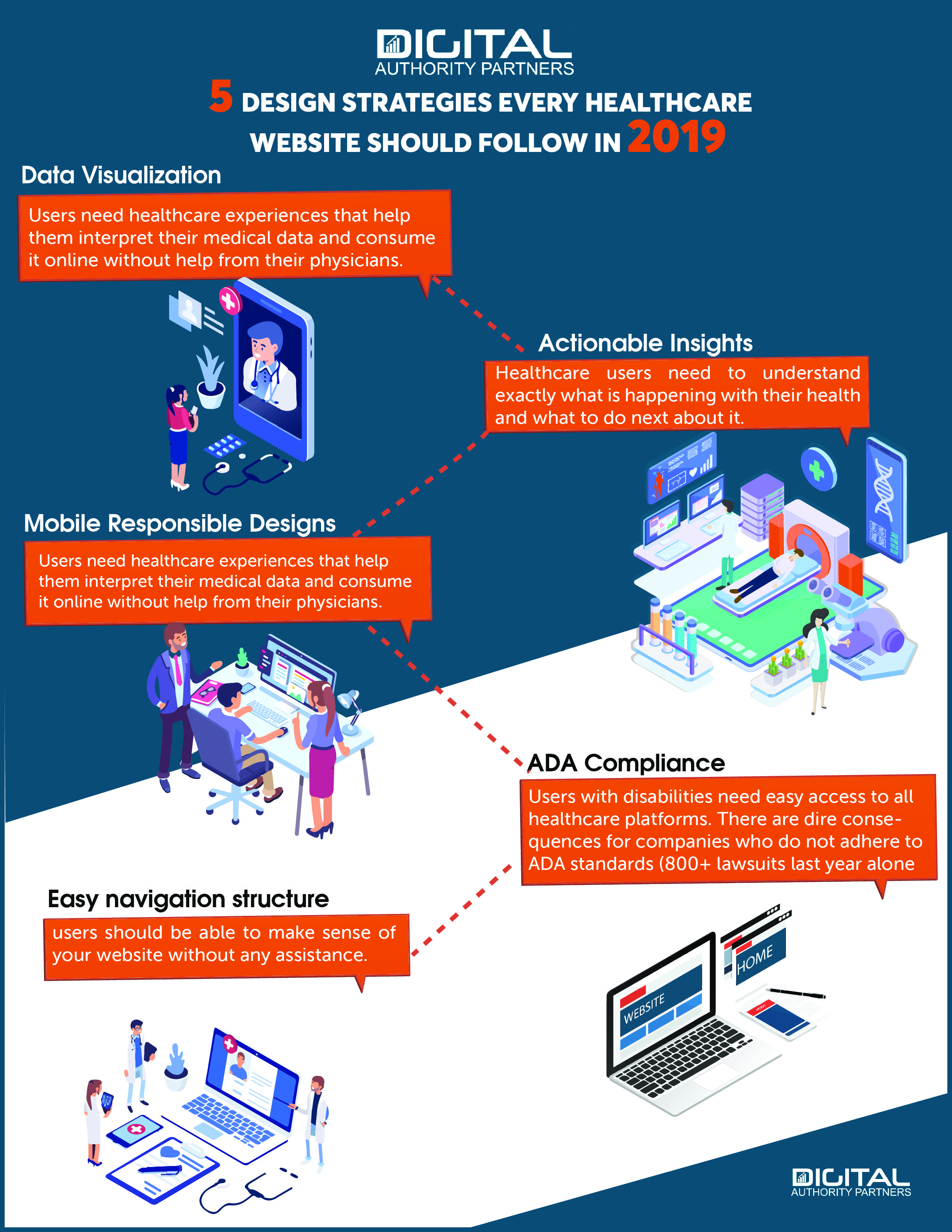
The infographic below shows what we will cover in this article and why we think it matters to every healthcare marketing executive.
1. Healthcare Website Design Experts Should Invest in Data Visualization Techniques To Help Patients Make Sense of Their Health
Data visualization is a concept many organizations in healthcare and elsewhere have started adopting. Traditionally known in the context of business intelligence tools, data visualization has started making its way into the consumer space.
In the healthcare space, the concept is simple: show users complex information in easily digestible ways that they can quickly make sense of it without assistance.
In the design space, of course, the poster-boy of phenomenal design is the online Fitbit dashboard.
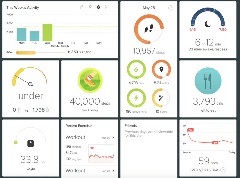
Fitbit was a pioneer in leveraging best-in-class design principles to create an interconnected experience between a physical device, a mobile app and their online dashboard. This was even more remarkable because it came from a health manufacturer, hardly the source one would expect for great designs.
From a pure data visualization perspective, nobody got it better than Fitbit. Many other vendors simply emulated the same overall display language and dashboard structure.
What makes Fitibit so amazing is that, as a user, you understand exactly how well or poorly you are doing from a fitness perspective in 30 seconds or less. Through a combination of iconography, warm color palette and explanatory text, their simple and intuitive designs require no additional explanation of any kind. It simply provides a wide variety of metrics that track your performance against your daily health goals.
Another remarkable function Fitbit enabled on their digital dashboard is the ability to “drag and drop” various modules on the page. For example, if I’m most concerned about my steps, water intake and sleep quality, I can move those modules to the top of the dashboard.
Fitibit’s digital strategy is simple: make people care about their health. Encourage them to be active. And show them the progress they’re making against the goals they’ve set up.
This is accomplished within a beautifully built intuitive design that uses an absolutely simple data visualization technique to help users reach their health goals.
2. Provide Actionable Insights Your Patients Can Understand and Act On
Have you ever been to a doctor and thought the medical staff were speaking a completely different language? Although you knew they were speaking English, the words seemed to be playing a trick on your mind and you couldn’t really understand what was being said.
Healthcare professionals use industry jargon that only makes sense to those with near daily exposure to these acronyms and technical terms. A recent study showed that medical jargon and lack of specific recommendations is clouding doctor patient communication.
The same argument can be expanded to the healthcare industry as a whole. Healthcare has only recently begun to become patient-centric. Such patient inclusion is still rare in many medical offices.
Becoming patient-centric requires a shift in the mental paradigm. Healthcare website design should include designing for emotion. This requires understanding –– and embracing –– the fact that patients do not have the same knowledge as medical professionals. Your digital interface needs to recognize this and be laid out so that it is very easy for digital users to understand what they are seeing.
Let’s take a look at a famous DNA testing and analysis dashboard.
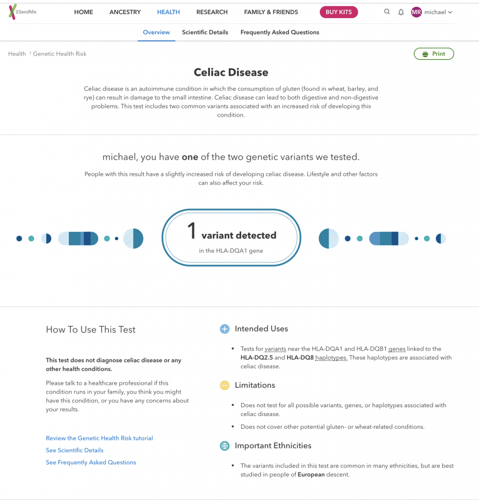
23andMe is dealing with very complex hereditary predispositions to specific diseases. In the above example, the user is predisposed to Celiac Disease. On the details page, 23andMe does an excellent job of “translating” this concept to the end user:
- It explains what the disease is
- It tells the user whether he/she is predisposed to it
- It recommends that the user to get in touch with a healthcare professional
- It clearly calls out this isn’t a diagnostic
- It highlights the intended use of the report and its limitations
All in all, this type of visual design and information architecture is everything a great healthcare website should be. It’s simple, in plain English, with clear visual elements and detailed explanations.
3. Healthcare Website Design Companies: Make Sure Your Website Is Mobile-friendly
For most of us in the digital strategy and design space, not having a mobile friendly website is preposterous. The vast majority of companies have built or redesigned their websites with one simple fact in mind: more than 50% of all web browsing in the world occurs on mobile devices as of 2018 (to be exact, 52%).
Unfortunately, the healthcare industry is not progressing as quickly in this direction as we would have hoped.
Look at the example below of two healthcare institutions in Chicago. The one on the left is mobile friendly, the one on the right is not.
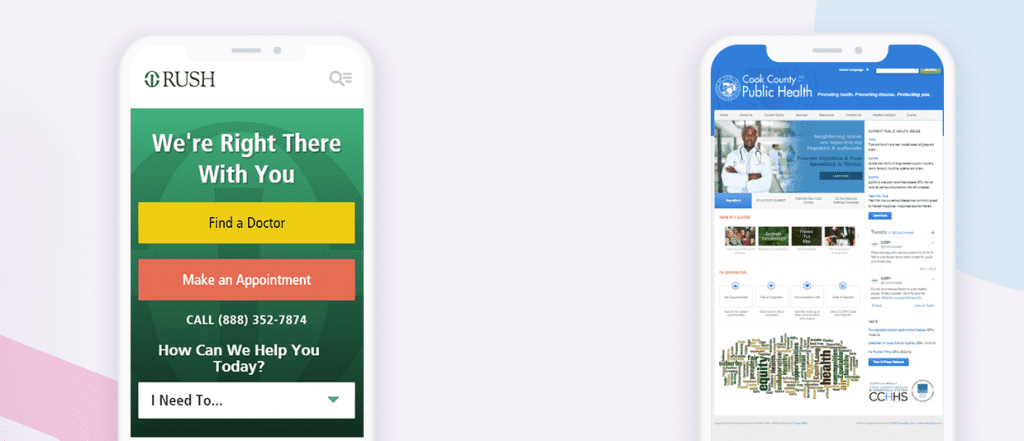
The importance of a healthcare website design that is mobile responsive cannot be understated.
First, it has been long established that Google de-prioritizes websites that are not mobile friendly in their ranking of search results. If your website isn’t mobile responsive, you might as well not exist unless a customer types in a specific branded term (for ex., the name of your company). For any other terms for which you may want to rank, you can kiss Google traffic goodbye.
Second, with smartphone access comprising more than 50% of traffic, you really want to make sure you provide these users with a great digital experience. After all, they’re coming to your site seeking information; if they can’t easily read the text on the screen, then you failed at your job as a healthcare organization.
Third, stay ahead of the competition. As you read this article, you may be thinking about this or that competitor without a mobile-responsive website. That may be true, but that’s not the point. Be the change you want to see in this world. Customers will reward you.
Even if most of your competitors don’t have a mobile-responsive website, that doesn’t mean you shouldn’t. Getting a mobile responsive site is both affordable and, for many, expected in 2024. So do it and beat your competition with a healthcare website design that is impressive in its simplicity and elegance while conveying the answers to questions patients ask.
4. Make Sure Your Website Is ADA Compliant
The American Disability Act is a comprehensive civil rights law that protects individuals with disabilities from discrimination. Since its inception, ADA guidelines applied almost exclusively to rules and regulations regarding public access to buildings, public areas, public transit, etc.
In 2010, the ADA issued a series of rules and regulations about website accessibility. In so doing, it opened the gates for lawsuits from both individuals and companies representing individuals who cannot process the information on a website due to failure to create user experiences that live up to minimum standards of accessibility.
You would think that healthcare companies would have learned over the last eight years how to become ADA compliant. Unfortunately, that would be an incorrect assumption.
In 2017, there were at least 814 documented lawsuits against companies for breaching Title III of the ADA (Website Accessibility Act) that included a variety of putative damage lawsuits.
One of the more famous lawsuits in the healthcare field involved Tenet Healthcare which operates various websites in Florida. The case was eventually dismissed but the company made dramatic changes to their website to become compliant.
So how does the ADA apply to healthcare website design?
It’s simple. The ADA uses the Web Content Accessibility Guidelines to determine whether a site is compliant. These guidelines have very specific recommendations for various aspects affecting the user experience of a digital property. In addition, in early 2018 the 508 standards for website compliance were instituted.
Both sets of rules have much in common. They boil down to these points. Any website that is accessible to the public should be:
- Perceivable
- Operable
- Understandable
- Robust
To measure how a website fares against these standards, the ADA has provided more than 100 guidelines for healthcare companies and agencies in this space. These guidelines affect anything-from typography, font, colors, animation, video production (example videos on a site should have subtitles – University of Berkley was sued over this in 2016) and more.
As a general rule, Digital Authority Partners follows all ADA (WBA) rules in its website design, without concern for whether the client falls under the ADA prerogative. Being ADA compliant, from a design perspective, shouldn’t be done just because it is the law. It should be done because it’s the right thing to do.
So how does a website that may not be ADA compliant look? Check the designs below from an Illinois hospital.
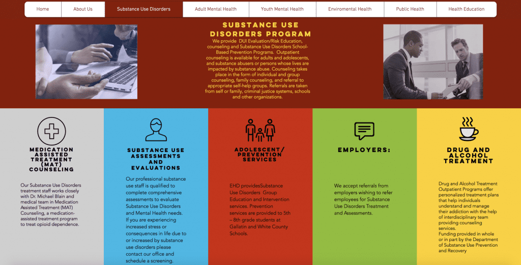
We can write an entire article fully dedicated to how this state hospital website is probably not ADA compliant. That would require analyzing each page and highlighting different parts of the ADA guidelines which may be breached.
In simple terms – just look at the section in the middle above. Bright red with dark black content. That content isn’t easily legible. Even as an able-bodied person, I’m having trouble reading the text given the color scheme used.
If I’m having trouble, imagine the difficulties of those who are color-blind and who will already interpret the red/blue/yellow above as grey. They would have a very hard time seeing grey on black.
Also, the website font size is abysmal. Even with normal vision, one needs to use the browser zoom function to read the information on the page.
Lastly, the team who built this website did a very poor job with the mobile responsive implementation. When accessing this site on a mobile device, reading the text in its entirety is impossible because the text cuts off on a phone as seen below:
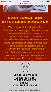
This is just one example which stands out not only because of the horrendous color choice used to build a healthcare website, but also because this healthcare company chose uninspired fonts, typography, and font sizes that are friendly to hardly anyone, certainly not those who are protected by the ADA.
5. Have a Simple Navigational Structure
Last but not least, any healthcare website should spend considerable time creating a simple and intuitive site taxonomy. Also known as the navigational structure, a website taxonomy is the way you organize your entire site so that it makes intuitive sense when users to go from one page to another.
It’s a simple principle: organize your entire site in such a way that any user can quickly understand how your site is structured. That way, users can find the information they’re looking for quickly and effectively and without seeking assistance from other people.
There are many websites with a phenomenal taxonomy, even more that have a decent one. However, there are also healthcare sites with taxonomies that don’t make the slightest sense to anyone outside of the IT department that built that website.
Here’s an example:
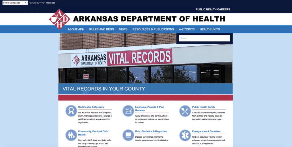
As I said above, the operative rule in healthcare website design (or any website) is to have a persistent, intuitive and logical organization of information on your site so that a user always knows where they are within the website and how to access other pieces of information there.
That sounds simple – but sometimes it’s not.
As can be clearly seen in the Department of Health example shown above, having a great navigational structure is not as simple to achieve as one would first think.
Why is this navigational structure so poor? Let’s take the page apart and do a brief analysis of the sections.
About ADH: this section should only include “about the department information.” Unfortunately, this section also includes legal documentation (like HIPPA regulations), consumer reports and “state of affairs” pages about how well healthcare coverage and service are going in the good state of Arkansas. In other words, the “About ADH” section is mish-mash of information types that do not logically fit with what a user would ever want to read when clicking on the ‘About” section.
Rules and Regs: this section also is more than expected. It contains information about emergency rules in Arkansas, but it also lists upcoming law amendments, legislation currently being considered on the Arkansas senate floor and more. With such a name, these are not items you would expect to see in this section.
A-Z topics: this is nothing more than a sitemap. This year, most websites stopped showing any site map. Oddly, for this organization, an antiquated sitemap is given primary real-estate in the global header. It is also entirely mis-named, to boot.
Health units: This is a term few would intuitively understand. This section provides the locations of all hospitals and clinics in the state of Arkansas.
A site structure is supposed to be simple, intuitive, and clear. That is the core element of any minimally effective healthcare website design. At base, it is supposed to be transparent in the organization and labeling of its information, as well as comprehensible without any further explanation.
Without a clear navigational path and organizational structure, your online visitors won’t find what they’re looking for and will abandon your site. To capture and retain them you should make these 2 elements one of your top 5 priorities when redoing your healthcare website design.
Summary:
Creating an engaging experience for your healthcare website design is a must have in today’s day and age. The reality is that consumers expect the same level of digital proficiency from their hospital or healthcare service provider in 2024 as they do from the other digital platforms they’re interacting with online.
In this article, we covered the top five healthcare website design principles that make or break an industry website. These include:
Data visualization: the ability to help users access and visually interpret their own medical data online without help from their physicians or other medical personnel.
Actionable insights: the ability of users to understand exactly what’s happening with their health and what to do next about it.
Mobile responsible designs: the ability of users to access information about healthcare providers on their mobile device.
ADA compliance: the ability of users with disabilities to easily access your healthcare platform.
Easy navigation structure: the ability of users to make sense of your website without assistance from a third party.
Do you need guidance with your digital transformation initiatives? Digital Authority Partners has worked with companies like Athena Health, Omron Healthcare, and Blue Cross Blue Shield on cutting-edge digital initiatives that improve patient outcomes and quality of care. Contact Digital Authority Partners at [email protected] or 312-820-9893.
Want To Meet Our Expert Team?
Book a meeting directly here
