Design Your Own Great B2B Email Templates Using These 7 Tips
Customers respond to consistency. People trust brands when they know what to expect, especially when the expectation is for high quality and attention to detail. Obviously, this applies to your product or service but the effect trickles down to every interaction with your business, starting from when they open up an email from you. If they can expect a consistent, attractive presentation, they will subconsciously trust you more. They may even look forward to your emails like receiving emails from an old friend.
So what does it take to design the perfect template for your B2B email marketing campaign? In this article, we share 7 tips on designing your own great B2B email templates:
 The layout is the first thing the reader will notice. Remember that overly busy layouts are confusing and make it less likely that the reader will continue on to the important parts of the email (especially the call to action). So, do not overburden the layout with excessive color and different fonts.
When in doubt, go simple. Choose one font, one or two colors, and break up ideas with concise headers to help readers get the most out of your email, even at a glance.
Make sure that the layout is responsive as well. Responsive layouts dynamically adapt to the screen size onto which the email happens to load. Make sure that the email is attractive and readable whether it is opened on a huge desktop monitor, a small tablet screen, or an even smaller smartphone display.
Responsive design not only increases the impact of the email for more users, but it makes the emails less likely to get filtered as spam. Spam filters can detect a lack of responsiveness and tend to flag it.
 Headlines jump out at people because of the bigger text. It is entirely possible that the reader will only read the headlines to decide whether or not they want to commit more time to reading the body text.
You must therefore hook the reader with the headlines. Think of them as a “secondary reading path.” If the reader only read the headlines, would they get the gist of the email? Try to strike a balance between telling the whole story with the headlines and teasing the story with the headlines, stoking the reader’s curiosity.
Try to keep your headlines brief — less is more. Challenge yourself to express the entire sentiment with as few works as possible.
 In addition to keeping a spam-compliant text-to-image ratio, try to optimize the imagery in the email so that it will quickly load. This usually means optimizing the images to take less data up less data without detracting from the image. For example, decrease the resolution, but not so much that the image will look blurry on high-definition screens.
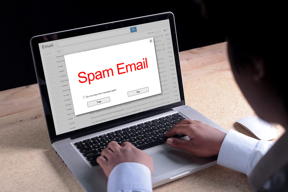
Fast loading is not only important to prevent frustration of the recipient (no one wants to wait forever for anything to load, be it a website or an email). It is also to avoid spam filters. Bulky, image-heavy emails tend to look more suspicious to spam filters. Big, slow emails are a serious spam risk, especially when you combine them with a domain that has not yet built up a strong reputation.
- Start with a clear and responsive layout.
- Consistently incorporate your branding.
- Use compelling and concise headlines.
- Balance text with visuals.
- Include clear calls to action (CTAs).
- Optimize for quick loading and spam compliance.
- Test and iterate for improvement.
Tired of investing in Search Engine Optimization without getting any results? See how Digital Authority Partners turns that around!
Understanding the Basics of B2B Email Template Design
Many email marketers choose plain text for their emails. They load quickly, do not raise red flags with spam filters, and many recipients prefer them because they feel less like advertisements and more like messages from a friend. Even email marketers who send designed emails tend to include a plain-text version side-by-side for readers whose email clients do not load designed emails, or for those who just prefer the plain text. If you want to try your hand at designing emails, it is built from the native coding language of most of the web (hypertext markup language, or HTML) combined with the Cascading Style Sheets language (CSS). HTML and CSS are relatively easy to learn, two of the first coding languages that most coders use. However, if you do not want to learn HTML or CSS for scratch, it may be necessary to hire a coder or delegate the design to your tech team. Many email autoresponders and email marketing management platforms offer a built-in WYSIWYG (what you see is what you get) design tool that allows you to create drag-and-drop email designs, no coding knowledge necessary. You can usually use these designers to create a template, then save that template for later or repeat use. Your platform may even come with pre-designed templates into which you just drop your content. But exercise caution. Those templates may be designed for looks, not deliverability. Ready to design your own B2B email templates? Here are some tips to follow:1. Start with a Clear and Responsive Layout
 The layout is the first thing the reader will notice. Remember that overly busy layouts are confusing and make it less likely that the reader will continue on to the important parts of the email (especially the call to action). So, do not overburden the layout with excessive color and different fonts.
When in doubt, go simple. Choose one font, one or two colors, and break up ideas with concise headers to help readers get the most out of your email, even at a glance.
Make sure that the layout is responsive as well. Responsive layouts dynamically adapt to the screen size onto which the email happens to load. Make sure that the email is attractive and readable whether it is opened on a huge desktop monitor, a small tablet screen, or an even smaller smartphone display.
Responsive design not only increases the impact of the email for more users, but it makes the emails less likely to get filtered as spam. Spam filters can detect a lack of responsiveness and tend to flag it.
2. Consistently Incorporate Your Branding
If you are going with visual email design, it needs to include your branding. Make sure that your branding is consistent across your emails. If you have designated brand colors, make sure to use those colors in the same place with each email. If you find a good place for your logo, keep the logo there every time. Incorporate your logo and colors in the signature, as well as any call to action buttons. If you have a defined style guide for the visual design and/or tone of voice, make sure to follow that guide for the visuals and the content so that it echoes the content users may find on your website. If at all possible, use your website or social branding as a design inspiration so that your content aligns across channels. You do not want your email to look and feel like it is coming from an entirely different person (or company) as your website.3. Use Compelling and Concise Headlines
 Headlines jump out at people because of the bigger text. It is entirely possible that the reader will only read the headlines to decide whether or not they want to commit more time to reading the body text.
You must therefore hook the reader with the headlines. Think of them as a “secondary reading path.” If the reader only read the headlines, would they get the gist of the email? Try to strike a balance between telling the whole story with the headlines and teasing the story with the headlines, stoking the reader’s curiosity.
Try to keep your headlines brief — less is more. Challenge yourself to express the entire sentiment with as few works as possible.
4. Balance Text with Visuals
The advantage of a designed email template is the ability to hook the reader not just with words, but with visuals. Break up the blocks of text with images and visual design elements like borders and divider lines. If you are designing a template and plan to vary up the images, include a placeholder box to show where the images will go. Do not go crazy with the visuals, though. Too many visual elements may make the email take too long to load, or worse, trip spam filters. The rule of thumb is 60:40 text to visuals.5. Include Clear Calls to Action (CTAs)
Do not assume that your audience will intuitively understand what you want them to do. Tell them what to do. Ask for the sale. Whether it is a button or a link, whether you are asking them to call (include a clear, bold, tap-to-call phone number), visit your landing page, book an appointment using a widget, or reply to the email, make sure to clearly ask for it. Use easy-to-find and easy-to-understand language. Even if the point of the email is to inform and give value, include the CTA. You may just catch the reader on the perfect day when they are in the mood to take action.6. Optimize for Quick Loading and Spam Compliance
 In addition to keeping a spam-compliant text-to-image ratio, try to optimize the imagery in the email so that it will quickly load. This usually means optimizing the images to take less data up less data without detracting from the image. For example, decrease the resolution, but not so much that the image will look blurry on high-definition screens.
Fast loading is not only important to prevent frustration of the recipient (no one wants to wait forever for anything to load, be it a website or an email). It is also to avoid spam filters. Bulky, image-heavy emails tend to look more suspicious to spam filters. Big, slow emails are a serious spam risk, especially when you combine them with a domain that has not yet built up a strong reputation.
7. Test and Iterate for Improvement
As with all things in digital marketing, email design only reaches its full potential if you constantly iterate and improve. Do not just make one design that you like and then rest on your laurels. Create several designs and split-test them to see which ones get the best response. Then over time, revisit your design and do more tests. Constantly try new things to see if you can get better and better results.Summing Up
You will probably send hundreds, even thousands of marketing emails over the course of doing business. It is worth taking the time to dial in the perfect B2B email template. Grab the challenge by the horns with clear and responsive layouts, consistent branding, compelling headlines, and the perfect balance of text and visuals. Also include clear CTAs, optimize for speed, and spam filters, and constantly test for improvement. Have questions about how to design the perfect B2B email marketing template? Contact Digital Authority Partners (DAP). Our extensive experience with the best practices of B2B email design will shave months, even years, off your learning curve and help you hit the ground running with a profitable email marketing campaign.Want To Meet Our Expert Team?
Book a meeting directly here


