Digital vs. Graphic Design: What They Are and Best Uses
Does graphic design differ from digital design? Yes, and knowing their definitions can help you maximize their benefits to create a memorable, engaging user experience (UX) that converts.
This blog post digs deeper into these two interrelated concepts:
- The definition of digital and graphic design.
- The elements and features of each.
- Their use cases or applications.
- How to combine them using IKEA as a case study.
If you are ready to dive into the world of creativity, read the article below. Let’s go!
What Is Graphic Design?

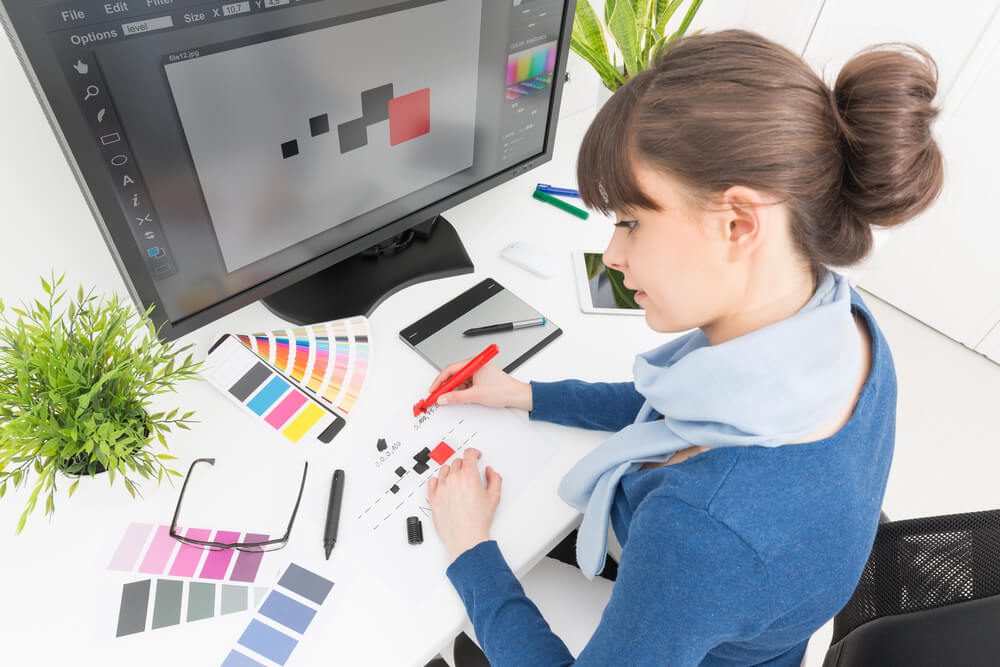
Loosely defined, graphic design conveys a message through visual content. To be more technical about it, it usually refers to more static elements in print and online media. These include logos, illustrations or sketches, infographics, and font typography.
As graphic design crosses into cyberspace, it follows many of the best practices of UX design:
| Principle | Definition |
| Balance | Distributing visual weight within a design and can be asymmetrical for tension or symmetrical for coherence. |
| Contrast | Placing different or opposing elements (such as color, shape, and size) close together to highlight key elements, guide the viewer’s eyes, and make the design more engaging. |
| Emphasis | Allowing a particular element to stand out through texture, size, color, or position to draw the viewer’s attention to a focal point or highlight a key message. |
| Repetition | Using the same visual elements or styles throughout a design for consistency and unity, helping reinforce branding. |
| Proximity | Grouping related elements together to help organize information and improve comprehension. |
| Spaces | Using positive (filled) and negative (empty) space to define relationships between elements and enhance readability. |
| Color theory | Utilizing colors and their gradients alone or as a combination to set a mood, emphasize a point, or strengthen the harmony among elements. |
Compared to digital design, graphic design has been around for ages. As early as 38,000 BCE, cavemen drew or painted animals, weapons, and hands to communicate with one another. By 1300 AD, noble families, especially in Europe, began creating crests and coats of arms, which can be likened to logos.
Since then, the use of graphic design has expanded, making it one of the most versatile art forms. In marketing, you can use it in the following cases:
| Use Case | Example |
| Brand identity | Logos, business cards, letterheads, and style guides |
| Traditional or offline advertising | Billboards, print ads, posters, flyers, catalogs, signage, murals, exhibition stands, and brochures |
| Publication | Books, magazines, newspapers, and newsletters |
| Packaging | Labels and manuals |
| Digital marketing | Images, banners, cover photos, website layouts, typography, and infographics |
What Is Digital Design?

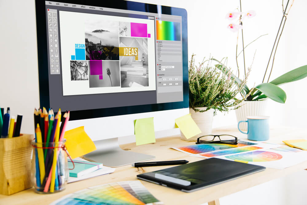
Broadly speaking, digital design creates visual content for devices, such as mobile phones and desktop computers.
The fact that graphic design mainly focuses on print is a misnomer because you also see such elements online. It can coexist with digital design. However, the latter is more interactive and immersive, increasing user engagement.
In addition, it adheres to similar principles as digital design, with some other essential ones. These include:
- Accessibility ensures that digital products and services are usable by people with disabilities. It involves text alternatives for non-text content or effective use of color contrast.
- Usability measures how effectively, efficiently, and satisfactorily a user is able to interact with a web or app interface.
- Hierarchy organizes information or elements in order of importance. For example, larger fonts are for headings, and smaller ones are for subtext.
- Simplicity emphasizes a clean, straightforward design. One example is using clear and concise language or prioritizing core functionalities over secondary ones.
- Clarity means users can quickly grasp the purpose and function of elements. For instance, a trash-can icon means “delete."
- Responsiveness is the app’s or website’s ability to adapt to various screen sizes and device orientations for an optimal viewing experience.
With the immense growth of technology and innovation, digital design is everywhere.
| Use Case | Example |
| App and website | Interactive elements such as buttons, interfaces, product displays, and checkout experiences |
| Digital advertising | Banners and video ads |
| Interactive installations | Touchscreen kiosks and immersive displays |
| Gaming | Menus and in-game heads-up displays (HUDs) |
| Augmented and virtual reality | Overlays and character and object interactions |
| Motion graphics | Animation and video content |
An Analysis of Graphic and Digital Design of IKEA
When done right, each helps build a brand. For example, you can upload a logo and a cover photo to your social media accounts or combine graphic design with web design and call it a day.
However, digital design shines more brightly when combined with graphic design. Consider IKEA.
The Swedish furniture maker’s font has undergone major changes over the years. In 2019, it shifted to Noto, a typeface from Google and Monotype. A product of five years of research, this font is said to be the most inclusive because it includes more obscure languages. It also means IKEA adapts to global markets.
The logo features the standard blue and yellow colors that make the name pop out and celebrate the brand’s heritage. After all, these shades comprise the Swedish flag. The color blue also symbolizes trust, reliability, and loyalty. Yellow signifies warmth, optimism, and happiness. By using these, the company evokes feelings of trustworthiness and homey comfort.
Sticking to its simplistic, straightforward brand identity, IKEA popularized the flat-pack concept in design. Each piece of furniture, which customers assemble, comes with tools, screws, and highly detailed instructions.
IKEA then carries over the same ideas in its web and app design:
- The website is clean, with plenty of white space. The sense of organization and breathability keep prospective buyers calm or less overwhelmed by the company’s huge inventory.
- Users can simplify the search according to different filter options. These include narrowing choices down to color, size, or price.
- High-quality images dominate the website. Plus, IKEA supplements the product descriptions with multiple views, close-ups, and sometimes videos.
- The website is highly localized. However, because the icons and layouts are universal, learning how to navigate a non-English site is easier.
- The shopping process is streamlined, with clear calls to action. Users are able to easily check product availability, add items to their shopping cart, and proceed to checkout.
- IKEA seamlessly integrates its website with other platforms and technology for a more holistic digital experience. These include mobile apps or augmented reality (AR), recently discovered through Google Search results.
Summing Up
Studies show that people learn faster with visuals rather than with text. Experience also teaches us that images, videos, and other media work well to connect with our emotions. For all these reasons, graphic and digital design are (and will always be) integral to your marketing strategies.
However, to make them worthwhile, they must influence your bottom line. As a leading digital design agency, Digital Authority Partners (DAP) has helped several companies in various industries achieve this goal.
Around 88% of our customers reported increased online sales after a redesign. We also decreased the bounce rate by 188% and improved ecommerce conversion rates by 41%.
Do you want to know how we do it? Contact us for a free consultation.
Want To Meet Our Expert Team?
Book a meeting directly here


