Fun and Exciting New Graphic Web Design Trends To Try
Want an updated look for your website this year? A design overhaul can improve website engagement, brand promotion, and business revenue. Check out exciting new graphic website trends from an expert San Diego digital design company:
- 3D graphics.
- Artificial intelligence (AI) images.
- Bright colors.
- Dark modes.
- Expressive font styles.
- Motion graphics.
- Retro designs.
Make your website fun and exciting. Find out which trend works best for your website. Let’s go!
To learn how Digital Authority Partners can create a standout website for you, watch this video!
Using 3D Graphics
Applying 3D graphics to a website is an exciting trend that can make websites more visually appealing and engaging. Designers may apply 3D models and animations to create a more immersive and interactive experience for website visitors, showing off a product’s features or using animation to explain how a service works.
3D typography creates a more attention-grabbing headline or logo, as if it's popping off the page, or using 3D to create a logo that looks like metal or stone. Designers can also use 3D backgrounds to create a more visually stimulating site, adding depth and perspective for a more dynamic and interactive experience.
When using 3D graphics, designers keep these techniques in mind:
- Use high-quality 3D models and animations for a professional look.
- Ensure that the graphics are responsive to looking good on all devices, including desktop computers, laptops, tablets, and smartphones.
- Utilize 3D graphics sparingly. Too much can be overwhelming and distracting.
- Highlight important information with them.
- Create a sense of movement and interactivity. Develop a unique and memorable brand identity using 3D graphics.
Including AI Images

Using AI images is another interesting graphic design trend that allows designers to create unique and visually appealing websites. An example would be a hero with featured images prominently displayed on a website. AI images can create eye-catching and engaging featured images that help to attract visitors and keep them on the website.
AI images can break up text and add visual interest to blog posts. They illustrate points and make blogs more engaging. Using AI images in product pages showcases products and makes them more attractive to potential customers. They also help customers visualize how products look in their homes or businesses.
AI images make marketing materials, such as social media posts, email campaigns, and print ads more inviting, helping increase engagement and conversions. Designers and marketers follow these best practices when using AI images on a website:
- Use high-quality AI images for a polished and professional appearance.
- Ensure that the images are relevant to the content to create a more cohesive and visually appealing design.
- Consider using AI images sparingly. Too much can be distracting.
- Apply these images to create a unique and easy-to-recall brand identity, such as a logo or header image.
- Include them in the graphic design to tell a story about the brand, products, or services.
- Use AI images to move the target audience into action, such as signing up for a newsletter, purchasing, or contacting the business for more information.
Trying Bright Colors
Bright colors create a sense of excitement and energy. They are effective for websites targeting younger audiences or those trying to sell glamorous or fascinating products or services. Sites about beauty, travel, or fashion are examples.
Bright colors make a website stand out from the competition because they help grab the user’s attention and make the pages and content memorable. Bright colors also help create a specific mood or atmosphere. For example, bright, warm colors can create a feeling of happiness and optimism, while bright, cool colors create a sense of calmness and relaxation.
Try the following when using bright colors on a website:
- Add them in the header and footer to make a website stand out.
- Use bright colors in all call-to-action (CTA) buttons to help drive traffic to a website's most important pages.
- Include them in the images and videos. This helps break up the text and adds visual interest to a website.
- Add bright colors to the typography to create a unique and memorable look.
Incorporating Dark Modes

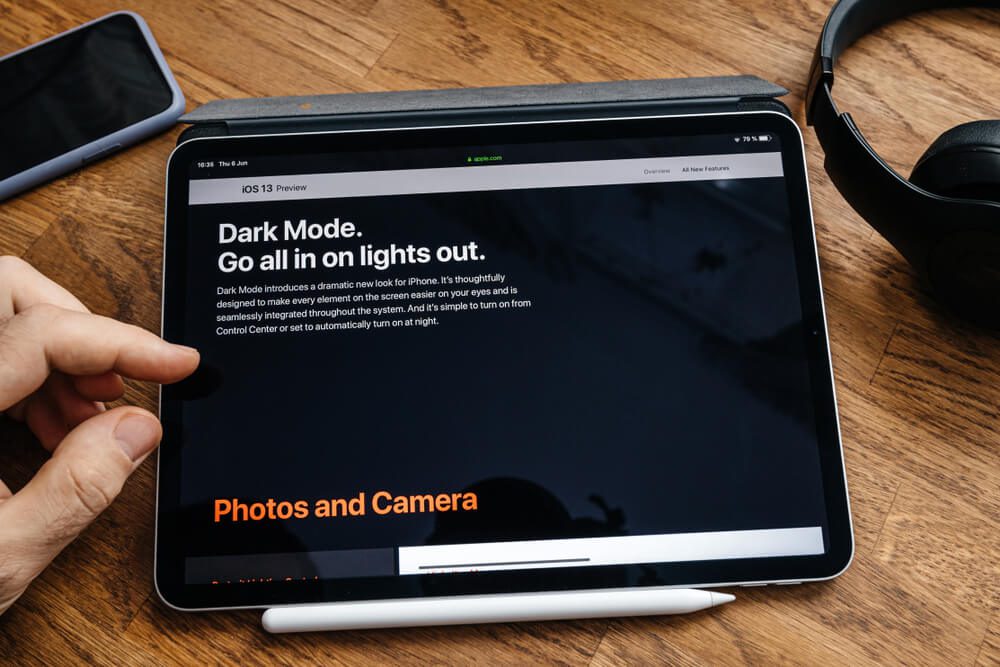
The dark mode is becoming increasingly popular for websites. A dark mode is a color scheme that uses dark colors for the background and light colors for the text and other elements. By adopting dark mode, websites reduce eye strain, especially for people who use their computers or smartphones in low-light conditions.
The dark mode also helps improve battery life on devices with OLED displays, which use less power when displaying black pixels. Dark mode can create a more immersive website experience by making the content stand out against the dark background. It is common on gaming or video websites.
Not all websites are suitable for dark mode. For example, those that use a lot of bright colors or images may not look as satisfying in dark mode. Test dark mode on the website to ensure that it looks good and does not affect the site's usability.
Here are techniques for applying dark mode to a website:
- Use a dark theme for the overall website design to change the website's background color to a dark color and the text color to light.
- Apply dark mode for specific elements on a website, such as the website's navigation bar, footer, or CTA buttons.
- Offer users the option to choose between light mode and dark mode.
- Make texts easy to read using high-contrast colors for the text and other elements.
- Add a light font to help the text stand out against the dark background.
- Before implementing dark mode on your website, test it on different devices, as the look may change from one type of device to the other.
Showcasing Expressive Font Styles
Expressive font styles are also a new trend in graphic design. These are fonts designed to be attention-grabbing and unique and to create various effects on a website. Expressive fonts develop a sense of personality — a fun and playful font is ideal for websites targeting children, and a more sophisticated font is ideal for business sites.
Make a website stand out by using expressive fonts that create a specific mood or atmosphere that easily grabs attention. For example, a font that evokes calm and relaxation is great for a website designed for meditation.
Apply expressive font styles to a website by following these techniques:
- Use expressive fonts for the website's main headings, CTA, and social media buttons.
- To make blog posts more appealing and engaging, replace traditional fonts with expressive ones.
- Add them in moderation to create balance with other fonts and elements on the website.
- Select expressive fonts that are easy to read. Avoid using too small or too complex fonts.
- Test on different devices, as expressive fonts may look different on various devices. Do this before implementing changes.
Improving Engagement With Motion Graphics

Motion graphics are a new trend that is becoming increasingly popular for creating engaging websites. Motion graphics are animations that create a sense of movement and interactivity on a site. They use a variety of effects to attract users' attention, explain complex concepts, and develop a sense of excitement and energy.
In a world with millions of websites, it can be challenging to stand out. Motion graphics easily attract attention. Take note of the following best practices when using motion graphics on a website:
- Use motion graphics on the website's main headings, CTA, and social media buttons.
- Add them in blog posts to increase visitor engagement and encourage them to visit your company’s website.
- Use motion graphics in moderation to balance them with other website elements.
- Keep them simple, as complex graphics can be distracting and challenging to follow.
- Create animated infographics to present complex information in a visually appealing way.
- Develop animated product demos to show potential customers how your products work to increase sales and improve customer satisfaction.
- Craft animated explainer videos to describe concepts.
Looking Cool With Retro Designs
While retro design might sound outdated, they are becoming a popular trend in graphic design. It can be a great way to add a touch of nostalgia and personality to a website. Websites with a retro design or theme appeal not just to older generations but to younger ones as well.
Like other graphic design trends, using retro designs carefully ensures an excellent user experience. Here are some tips to remember:
- Choose the right colors. Retro designs often use bright, saturated colors popular in the 1950s, 1960s, and 1970s. Popular retro colors are pink, orange, yellow, and turquoise.
- Use geometric shapes such as squares, triangles, and circles to create borders, backgrounds, and other design elements.
- Include vintage fonts to add a retro vibe to a website. Use free and paid vintage fonts available online.
- Incorporate retro illustrations to add a touch of fun and personality to a website.
- Add retro patterns such as polka dots, stripes, and zigzags, which can add a touch of visual interest to a website.
Summing Up
Fun, exciting, and updated graphic design trends can not only overhaul your website but also improve website engagement, brand promotion, and ultimately business sales and revenue. Work with an experienced San Diego digital design company to make your website stand out from your competitors and attract potential customers.
Partner with experts in graphic web design. Contact Digital Authority Partners (DAP) today.
Want To Meet Our Expert Team?
Book a meeting directly here


