8 Key Elements of a High Converting Landing Page
As a business, you may already have a beautifully-designed landing page. But the burning question is: does it make a substantial impact and drive conversion?
A high-converting landing page impresses the visitor right off the bat. It does what a website cannot do — focusing on one dedicated conversion goal.
No matter the goal you're trying to achieve — driving sales, collecting visitor info, or converting blog traffic — your landing page aims to get that goal to convert. But how can you ensure your landing page realizes this?
While there are no guaranteed ways to get your visitor to take your intended action, experts agree some elements are impactful enough to guide them toward your conversion goal.
This guide will walk you through the key elements of high-converting landing pages, along with real-life examples of companies employing them. We’ll get into the details to help you build similar web pages for your site.
Want to learn more about the Digital Authority Partners approach to SEO? Watch this video!
A high-converting landing page has all the features that encourage visitors to take action. Here are some examples of how companies use these elements to get their target audience to convert.
1. Catchy headline and subheadline
The headline is the first thing a prospect notices after landing on your web page. That is exactly why it should be attention-grabbing, compelling, and clearly state what you offer to keep them on the page. Even if you already have a catchy domain, it’s the headline and subheadline that keeps visitors engaged.
Your headline should be concise, explaining your service in a few words. But if you can't fit all the good stuff, you can write a subheadline, which is an extension of the former. It essentially fills in the blanks by adding more details about your offer.
Highly-converting landing pages have headlines that are:
- Simple and short
- Attention-grabbing
- Target audience-focused
- A/B-tested
Amazingly, Poll Everywhere checks each of those boxes:
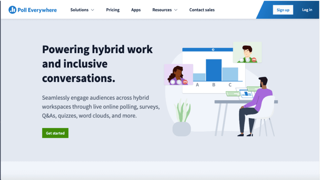
The headline presents a clear and concise offer, while the sub-heading details what makes the offer unique and valuable. It also does a great job of convincing the reader to stay on the page by adding a persuasive layer to the headline that tells you the different ways you can engage audiences ("through live polling, surveys, Q&As, quizzes, word clouds, and more").
2. Compelling features and benefits
A catchy headline can grab your visitor's attention, but features and benefits provide more details and answers to any other questions the visitor may have. The features should describe what your product or service does; the benefits describe the value you bring to your clients.
Ideally, a highly converting landing page quickly gets to the point. Respect the viewer's time and attention by highlighting solutions to their pain points and focusing on the value they can get.
Not to toot our own horn, but Digital Authority Partners's landing page is an excellent example of clever brand positioning:
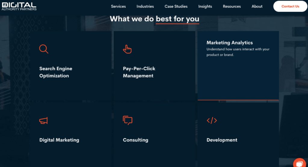
We've highlighted the salient features of all our services, complete with subtle logos. A simple mouse hover on the features reveals how our data-driven marketing services will help our target audience — you — scale your business.
3. Clear, engaging copy
Once your prospects pass the headline, it's time to drive your message home with clear and engaging copy. Well-written copy uses compelling verbs that convince the reader to take further action.
Your copy is the heart of a highly converting landing page, so it should highlight your product's or service's specific benefits while using words that evoke emotions. It is the key to maximizing your PPC campaigns, so it should be persuasive and actionable.
Take a cue from Emotive, an SMS automation marketing platform:
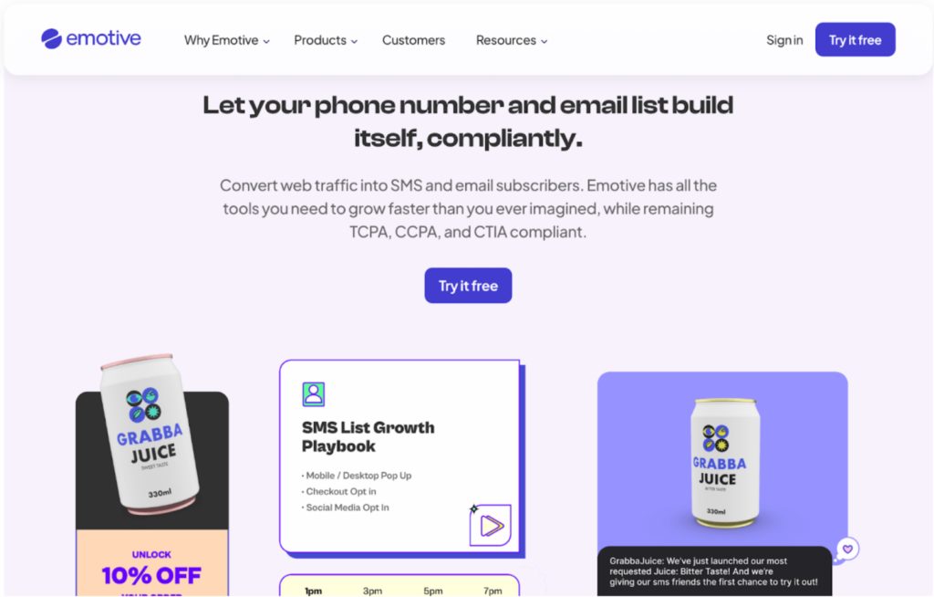
The company uses words like "Let your email list and phone number build itself, compliantly" to make the reader curious about their offer, compelling them to try it out for free. In just one line, Emotive tells the reader what it can do for them.
Similarly, you should write concise, engaging copy with impactful words for your landing page to drive users to take immediate action.
4. Social proof and trust elements
Social proof or trust elements can be anything from testimonials and reviews to customer logos and industry certifications. They’re a powerful persuasion tool showing prospects that others have bought what you're offering.
Social proof is a proven tip to drive organic traffic. Today, people won't book a table at a restaurant or buy a product from Amazon without checking reviews. In fact, a BrightLocal study found the average customer reads up to 10 reviews before deciding whether or not to buy a product or subscribe to a service.
Including social proof in your landing page inspires trust in your brand and removes any doubt in the visitor's mind about your credibility. They are likely to convert when they read about the experiences of real people and companies.
Here are a few tactics to show social proof on your landing page:
- Counts of the number of signups
- Awards from reputable organizations
- Customer testimonials and reviews
- Trust seals to establish security
- Ratings
- Case studies
- Customer logos or trust badges
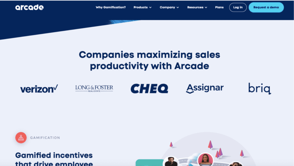
Gamification software company, Arcade, displays previous customer logos to prove renowned companies use its services. It also displays client testimonials further down the landing page, which inspires trust in the company.
Another great example that leverages social proof is Omniscient Digital co-founder David Khim's Speaking landing page.
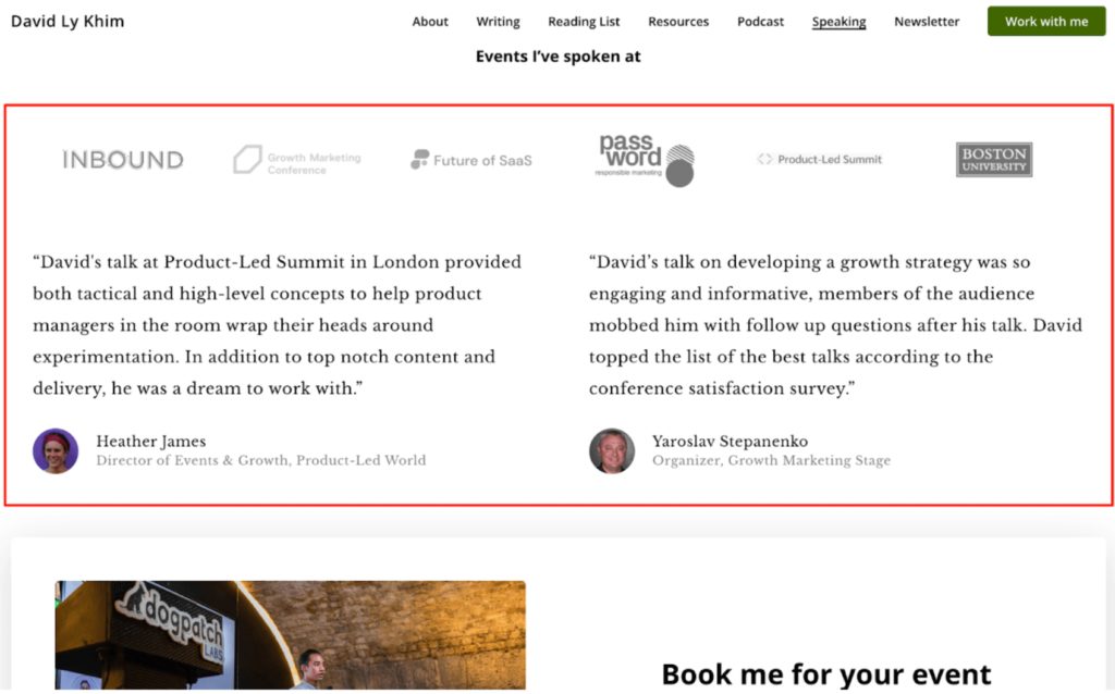
David wants visitors to book him for speaking engagements, so he cleverly incorporates a section mentioning the previous high-profile events where he has spoken. This, along with testimonials detailing his expertise, instantly establish his authority and make him appear more credible.
5. Eye-catching images
A landing page with only text, even though the copy is thoroughly engaging, Does not interest readers. Adding visuals helps break up your text and bring life to your landing page, making it more engaging for visitors.
Your imagery should be as powerful as your headline. It should represent your product or be relevant to your service. The use of product imagery, for example, is a critical ecommerce store's landing page design tip. It's an excellent marketing tactic that helps the customer understand your product, positively impacting purchase decisions.
The best image to use is appropriate for your target audience and reflects their interests. Other visual options that drive visitors to a conversion goal include:
- Illustrations
- Graphics
- Videos (product demos and video testimonials)
Landing page aesthetics and layout should create visual cues that draw attention to areas of the page with information that readers are most likely to need or actions they can take. It's a play on human psychology — drawing the visitor's attention to your desired direction.
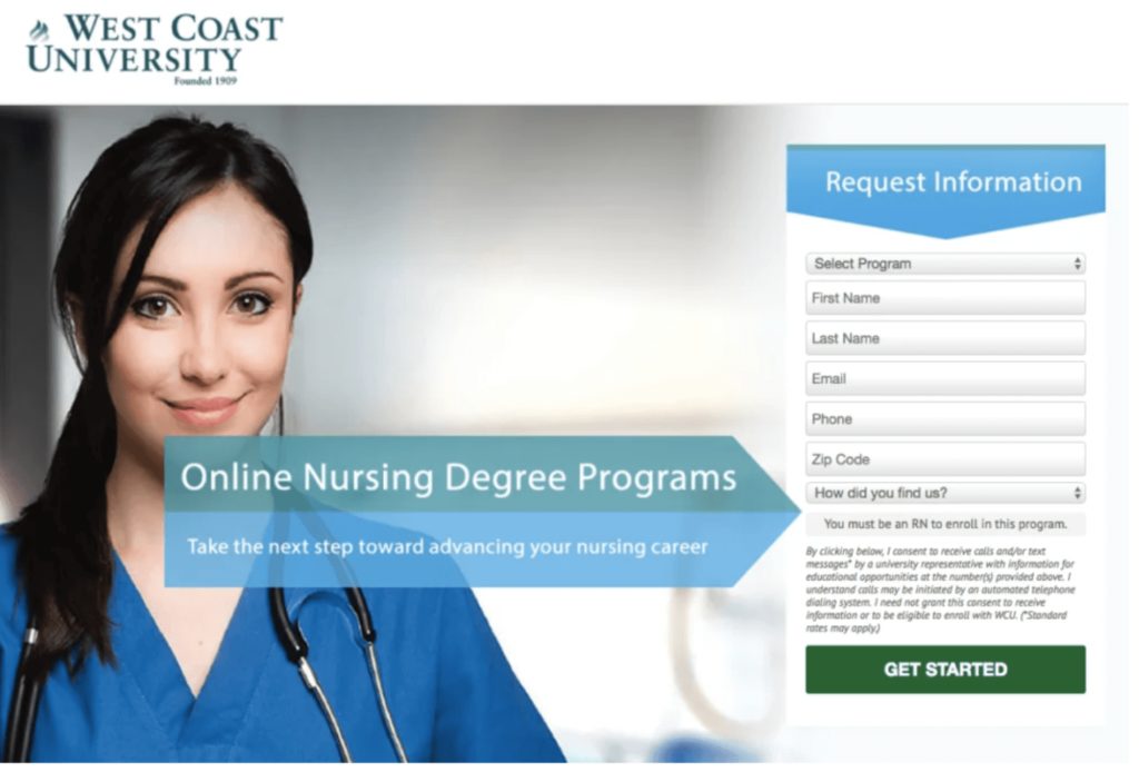
In this example from West Coast University, the arrow overlapping the image directs the visitor's gaze to the form and CTA button. A highly converting landing page tactic!
6. CTA buttons and sign up forms
Driving organic search traffic to your page and getting that traffic to convert are two critical elements for boosting conversion rate. What is the use if you get millions of views on your landing page and fail to convert?
A good CTA is a short statement that provokes an instant response from the reader. It's clear, persuasive, and assertive. Some common examples across the web are "Sign up here", "Add to cart", and "Join our newsletter."
Here's a quick rundown of pointers to keep in mind when writing CTAs for your landing page:
- Make your CTA stand out to immediately inform users of the next steps
- Use bold and contrasting colors so it's distinct from the rest of the page
- Perform A/B testing to determine which elements — statement, color, and font — work best for your audience
If your CTA is a form, keep it short and straightforward. Only request essential information as people can be wary of divulging personal information — just like this one for Turnkey.
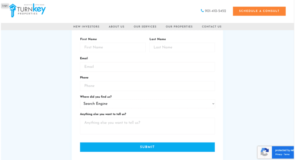
Turnkey's specific goal is to build a list of property owners currently listed on other platforms like Airbnb and HomeAway. To do this, it has created a form that only requests specific, absolutely necessary information. A vibrant “Submit” CTA button stands out.
7. Balanced structure
The design of a landing page is significant for conversions. It's usually a mix of elements like the headline, image, copy, client testimonials, trust badges, and call-to-action buttons. Each element has its role to play in getting the visitor to convert.
While these elements are crucial, remember that you have only a few seconds to convince your visitors. So your landing page should be self-explanatory with minimal distractions.
The elements on the page should follow a structure. Use legible fonts, and make sure the paragraphs are easy to digest and understand.

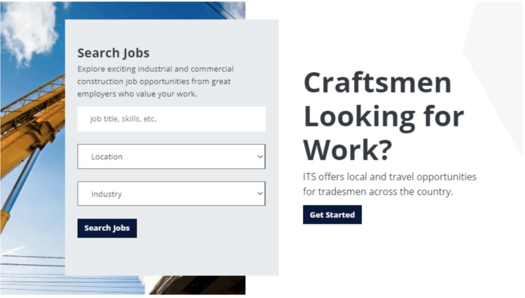
This ITS company landing page does a great job at balancing structure. It offers construction staffing solutions with a striking headline stating the company's unique selling proposition (USP). A high-quality image in the background with other well-spaced sections minimizes distractions.
As you scroll down, you'll find a section directing you to the next steps. ITS has also used lots of white spaces to better maintain their structure balance.
8. Unique Selling Proposition
A unique selling proposition (USP) differentiates you from competitors. It tells your visitors why you're unique and what they can expect when they do business with you. It's a one-of-a-kind brand promise that compels them to choose you over other companies.
In the competitive business landscape, customers want to know they are choosing the best solution available. So make your landing page clearly reflect your USP.
Follow these best practices to create a unique selling proposition:
- Clearly outline who you are and how your offer will benefit your prospects
- Break down your offering to the most basic level
- Describe the specific benefit your visitor will get from choosing your product
- Explain how it can solve their problem or address their pain points
- Get to the point quickly to reduce bounce rate.
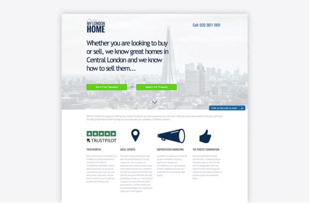
A perfect example of a USP is MyLondonHome, a real-estate company. Its USP is very specific and straight to the point, telling you the company lists great homes in Central London and how to sell them.
Another great USP-focused landing page is Ahrefs.
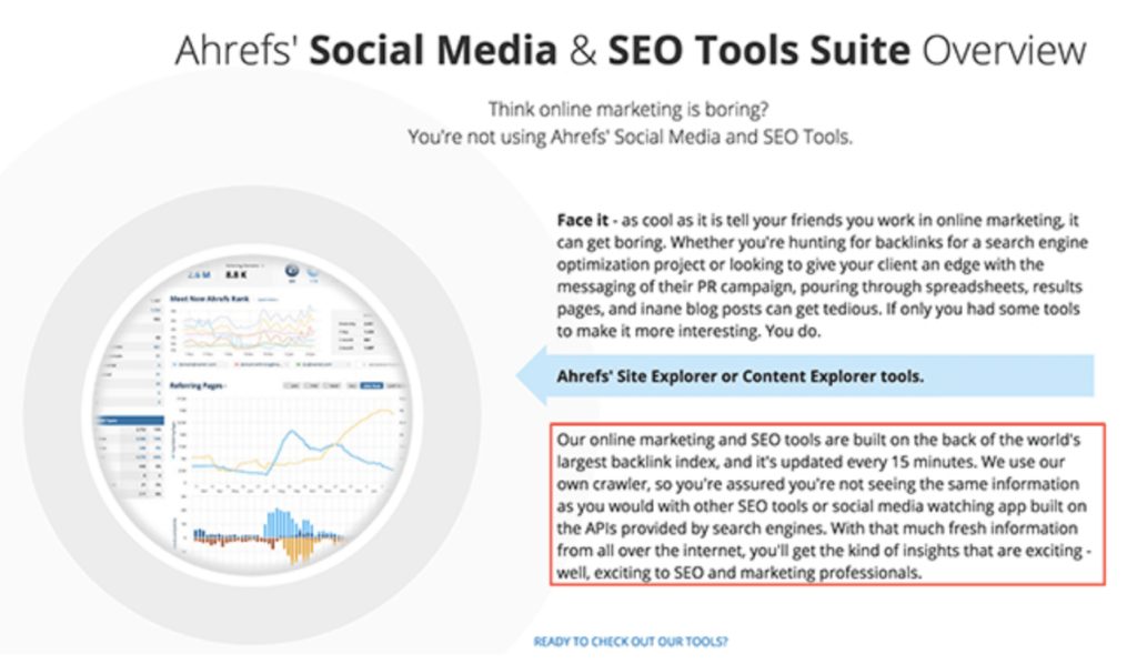
The company mentions a detailed and specific benefit, showing why Ahrefs differs from other SEO tools. It also breaks down to the granular level, helping visitors understand what the company is offering and why it should be their preferred choice.
Enlist Digital Authority Partners To Improve Your Conversions and Web Presence
A high-converting landing page is critical to your business's success, regardless of whether you're in marketing or healthcare. It generates the majority of your new leads and, therefore, demands attention.
To improve your conversions, return on investment (ROI) and web presence, you must take action to create and optimize your landing pages. Otherwise, prospects will bounce off as soon as they land on your page. Make sure you use the elements we discussed above and keep track of your website visitors to find out what works best for your target audience.
Alternatively, you can contact Digital Authority Partners to get tailored growth-oriented digital marketing programs for your business and drive growth. With our team of expert strategists, engineers, analysts, designers and marketers, we help achieve marketing excellence.
Want To Meet Our Expert Team?
Book a meeting directly here


