Raise the Bar With an ADA Compliant Website
“We need to make every single thing accessible to every single person with a disability.” ─ Stevie Wonder
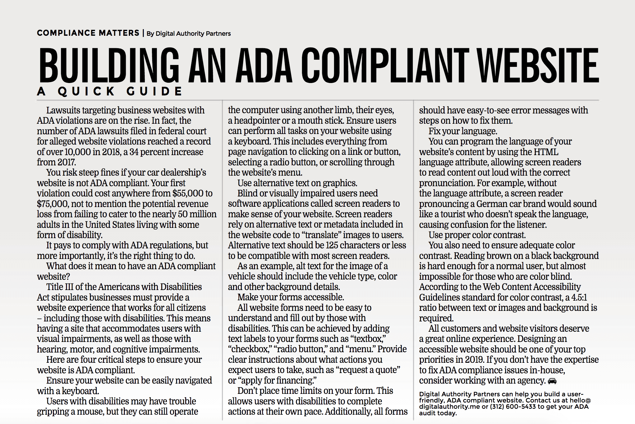
To us at DAP, this means building ADA compliant websites and digital experiences that enhances the lives of all the users we touch. We take our work seriously and are proud to share that our article covering ADA compliance got featured in the newest issue of the Colorado Independent Automobile Dealers Association (CIADA), a top automotive retailing trade publication.

We’d like to take the opportunity to thank the forward thinking leaders at the CIADA for bringing this pressing issue to light, effectively enabling all businesses in the automotive sales space to reach more customers.
The latest figures from the US Census Bureau indicate that nearly 1 in 5 Americans have a disability. The lack of ADA compliance means alienating millions of potential customers. Moreover, ADA compliance isn’t a feature ─ it’s a requirement.
According to the Bureau of Internet Accessibility, when the Americans with Disabilities Act was signed into law in 1990, the Internet was still in its very early stages of development. The rise of technologies like websites and mobile apps has raised questions about the ADA’s original intent to make the US society more accessible to people with disabilities. Although the ADA doesn’t explicitly mention websites, it has been widely interpreted to extend to them.
By the same token, legal precedent over the last decade has shown that ADA compliance rules do indeed apply to websites. Taken together, ADA compliance isn’t a nice-to-have, ADA compliance is mandatory.
When it comes to a website that’s accessible to everyone, here are some elements of ADA compliance that often get overlooked:
- Ease of navigation: Can users get around your website solely using a keyboard? Reason being, some users have a hard time gripping a mouse but can navigate a site with a keyboard using another limb, their eyes, headpointer or a mouth stick.
- Alt text on all images: Can screen readers discern every visual element that’s on your site? Blind or visually impaired users use software called screen readers to understand your site content. If there is no alt-text on your images, your users will miss out on pertinent information on your website.
- Accessibility of forms: Are all forms easily understood by all users? Elements like “textbox,” “checkbox,” “radio button,” and “menu” can help increase accessibility. Another important consideration is the elimination of time limits for forms to be filled out. This way, users can complete forms in their entirety at their own pace.
- Language: Is the language of your website’s content coded correctly so users with screen readers can properly understand it when it reads your site content aloud? If not, this can be fixed by programming the correct language in the HTML language attribute.
- Contrast: Can color blind users discern proper color contrast on your site? According to the Web Content Accessibility Guidelines for color contrast, a 4.5:1 ratio is required for text, images, and background.
In short, there is no turning back from a world that is becoming increasingly digital. Companies that work to ensure their websites are equally accessible will be the ones that capture more customers and thrive.
We are grateful to the CIADA leadership team for the opportunity to present the elements of an ADA compliant website to their readers at a high level and hope to be a first-rate resource in this manner.
_________________
Have questions about website ADA compliance? Contact us at hello@digitalauthority.me or watch our latest webinar: Accessibility Matters: Making Your Municipal Website ADA-Friendly.
You Might Also Like:
A Guide to ADA Compliance for Hotels and Event Venues
Want To Meet Our Expert Team?
Book a meeting directly here


